How We’re Making the Notarize Experience More Accessible
We want all users to be able to use our product with comfort and ease. Part of that is making it accessible and inclusive to those with disabilities.
Razelle McCarrick
April 15, 2021
3 min
At Notarize, we want all users to be able to use our product with comfort and ease. Part of that is making our product accessible and inclusive to those with disabilities.
Much like we incorporate ramps and elevators into building infrastructure for those with disabilities, we have a responsibility to do the same with software and the web. This year, Notarize has committed to improving the accessibility of our product – starting with the individual signer experience.
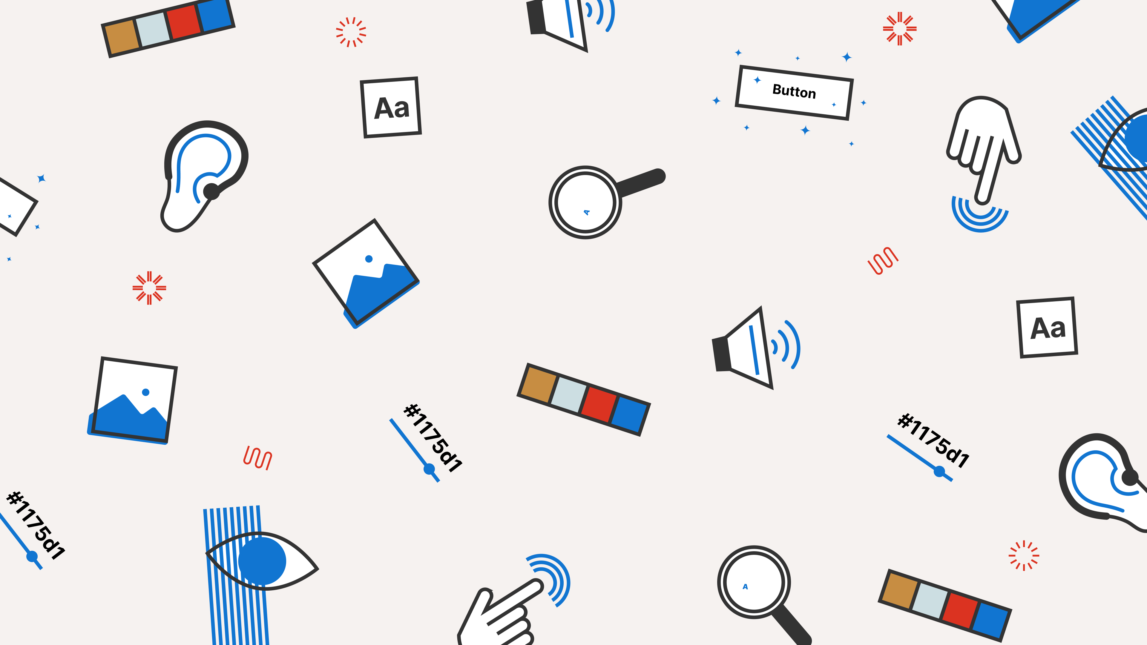
Accessibility, also known as a11y, is the usability of a web application or software for all users, including those with disabilities. One user might have a slight impairment to their vision that makes it harder to read small fonts. Another user might rely on keyboard navigation due to a motor impairment that makes it difficult to use the mouse. Some users are completely blind and rely on screen readers and keyboard navigation to read the elements and their behavior out to them.
Accessibility is about making your web experience inclusive.
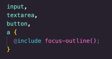
By default, all native elements in a browser are accessible with keyboard navigation IE: elements such as <button>, <a>, <select>, and all <input> types, including radio buttons and checkboxes.
If you build a site purely out of HTML, tab navigation and all expected keyboard actions will work right out of the box thanks to the browser building this behavior in. You would, for example, be able to tab onto a <select> menu, press the spacebar to open it, use the arrow keys to navigate the options, spacebar or enter key to select an option, and Escape key to close it.
However, when we develop complex web applications using a front-end framework and custom-built components, we have to sometimes manually build the behavior back in ourselves or see where we can use the native elements instead.
There are many more considerations for a11y beyond what the native elements in the browser can do. Screen readers will read out to the user what type of elements they are engaging with, what those elements do, and what state they are in at the present moment. A user might be wondering, “am I on an element that opens a menu? Is that menu open or closed at the moment?” In order for them to know, we have to add ARIA attributes.
For example, “aria-haspopup” tells the user a button will open a popup, while “aria-expanded” tells the user whether that menu or some other expandable content is expanded or not.
We also have to ensure we are using the correct semantic elements in our HTML. We can style a <div> to look like a <button> and add an onClick event, but those are semantically two different things.
A user expects a button to be activated with the enter or spacebar key. They do not expect a <div> to do anything. And they are right! A <div> is not an interactive element, has no built-in keyboard behavior, and is not in the natural tab order.
A button, on the other hand, we know can be tabbed onto, and activated by the enter or space key. Therefore, when a user is informed they are on a button element, they know what to do with it. When possible, it is best to use the most semantically accurate elements.
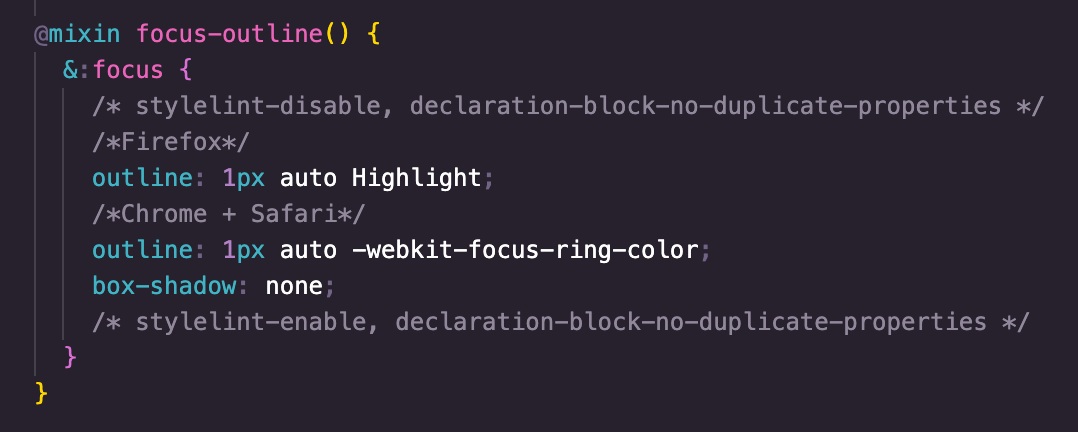
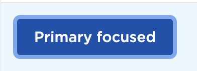
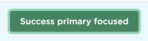
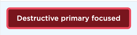
We started the process of making our individual signer experience accessible by breaking the project into different parts, the main one being keyboard navigation. In the beginning, the portal had virtually no visible focus indicators (the outline for an active element), so even if tab navigation was working, you couldn’t see it.
First, we gave focus indicators to all interactive elements on a global level and created unique focused button styles for all our buttons. Just adding these focus indicators put us in a much better place.
Then we built the keyboard behavior you would expect into our popout menu component. Below is a good example of a custom component.
It’s not a <select> menu, but we want it to act like one. So we created custom reusable React hooks with event listeners that handle the logic for focusing the first element on open, tabbing, or using arrow keys to cycle through menu items, using spacebar or enter key to select an item, and using the Escape key to close the menu.

We did the same for modal keyboard trapping, which is where you only allow tabbing of the elements in a modal and not behind it. This is where it got interesting because we sometimes have pop-out menus within modals and the Escape key listener for each is on a document level, so it would close both at once.
To solve this problem, we created an a11y React context and wrapped our app in the corresponding Provider so that components, as they are opened, can basically tell the context, “I’m the most specifically open component” and then only apply the Escape key behavior to the component who is most specific (or is on the top of the stack).
Some of the other portions of a11y we addressed were informative page titles for each screen, the ability to zoom to 200% without losing horizontal real estate, and font contrast.
Accessibility is a learning experience and area of expertise on its own. We’re excited about all the progress we’ve made so far and look forward to the next phases of this work so that we can make Notarize accessible to all users!

Check out other posts that are related to this topic.